Origins of Auto Emblems or logos
review and news icon
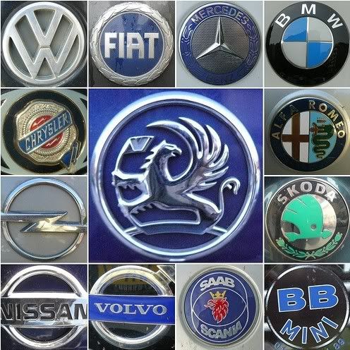
Logos and emblems are less important in the automotive world than what auto designers call “down the road graphics. The goal is that from a distance the three dimensional form of a vehicle read itself reads a flat image, a stop-action graphic. Ideally, the brand of the vehicle should be visible form the any angles. The term “Down the road graphics” have to be visible from all angles, including the most oblique ones.
ALFA ROMEO
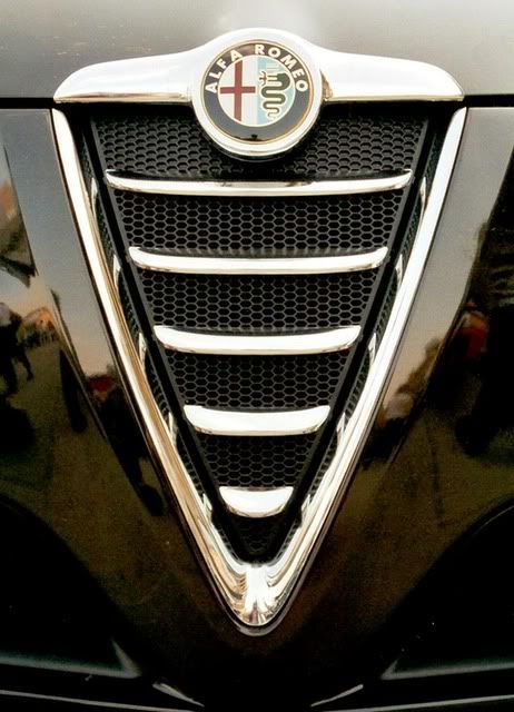
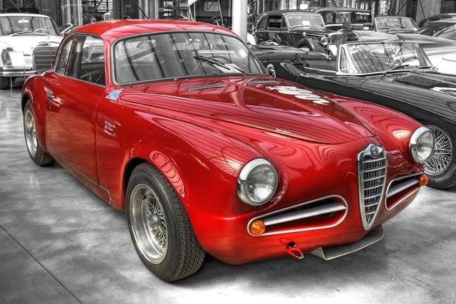
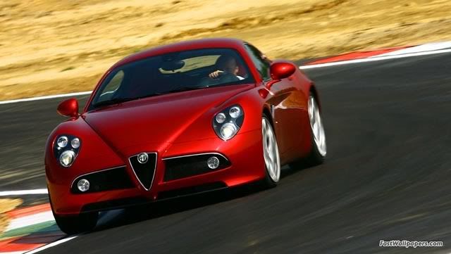
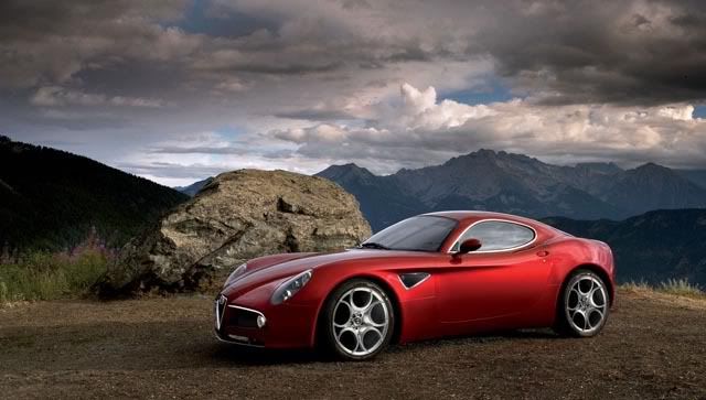
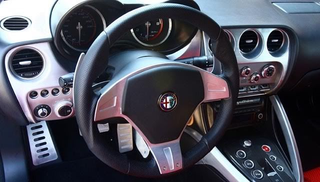
Alfa Romeo hails back to the city arms of Milan and the 12th century bishop who bestowed them.
AUDI
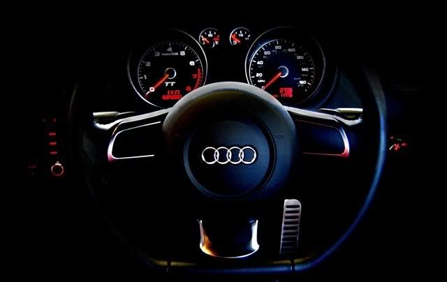
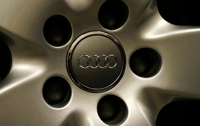
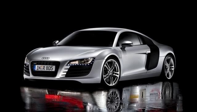
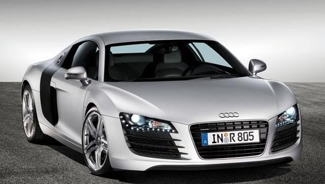
Audi’s four rings have nothing to do with the Olympics but represent the juncture of four earlier German auto companies in 1932. Horch, DKW, Wanderer and Audi were forced to ally by depressed market conditions to form Auto Union. After the war, the company finally took the name Audi which is Latin for “I hear,” a translation of the name of August Horch, founder of the company that bore his name, but kept the Auto Union rings.
BMW
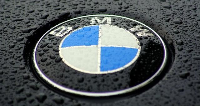
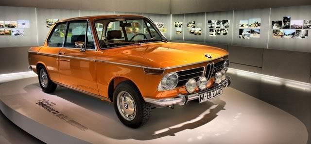
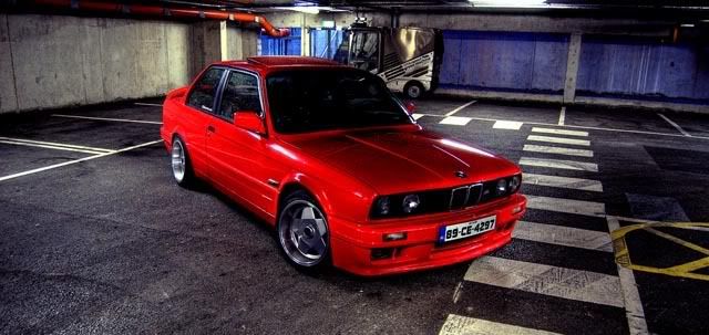
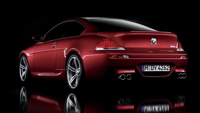
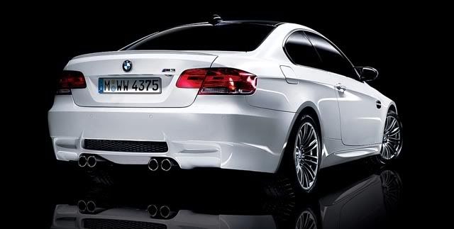
Bayerische Motoren Werke AG (Bavarian Motor Works) or best known as BMW,has its own interpretation towards its logo. BMW’s circle with blue and white quadrants is an interpretation of the image of a spinning propeller, powerfully simple as an early airline poster and suggesting the company’s beginnings in building aircraft engines.
CADILLAC
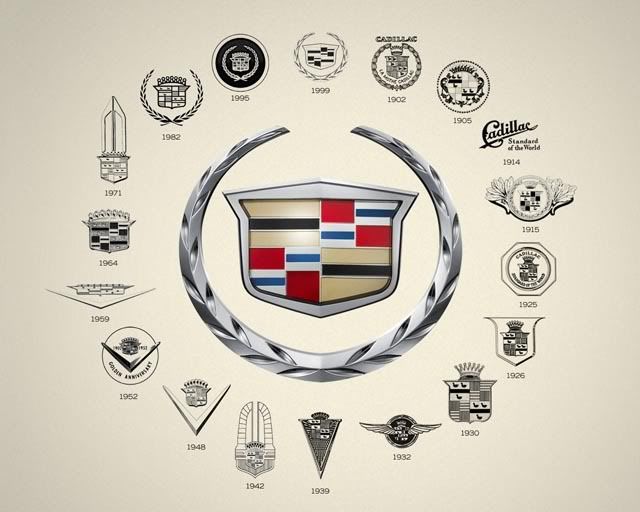
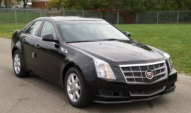
The original Cadillac logo is based on the family crest of the man for whom the company was named, the Gascon officer and minor aristocrat who founded Detroit in 1701-Antoine de La Mothe, Sieur de Cadillac. His coat of arms, like many family coats of arms, appears to have been concocted and borrowed from a nobler neighbor. This may be appropriate for a car that has often appealed to the self-made man-if the not the nouveau riche hustler.
CHEVROLET
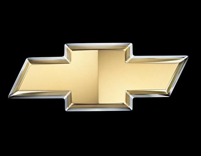
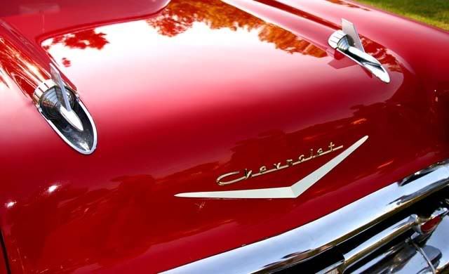
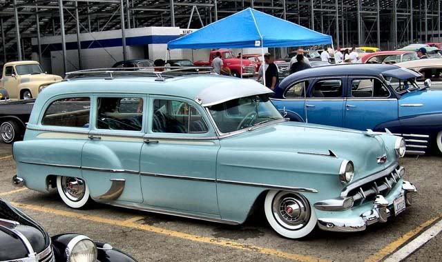
The Bowtie logo was inspired by the wallpaper at the hotel where William Durant, the General Motors founder stayed back in 1907. Since then, based on the wallpaper design, he created endless designs for the car that bears the name of Louis Chevrolet, a famous race driver at that era. Durant envisioned the bowtie design as symbolizing “The Heartbeat of America.
FERRARI
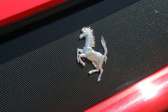
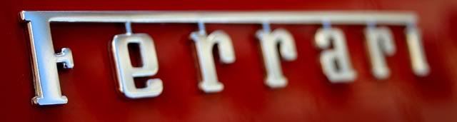

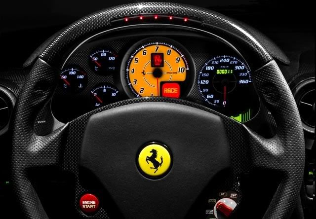
Ferrari’s rearing stallion has roots in insignia of World War I Italian fighter. Citroen’s chevrons come from stylized gear teeth.
FIAT

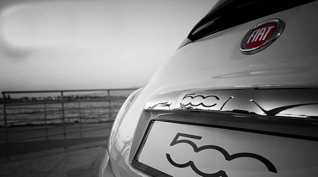
Some logos evolve but, like Time Warner’s infamous “IUD,” are abandoned in favor of their predecessors. In the 1980s Fiat supplanted its pre war, wreathed emblem in favor of a Scrabble piece letter logo. The story goes that Fiat design chief Mario Maioli was driving past the company’s Mirafiori factory one night in 1982 during a power outage. He noted a neon sign outlined against the dark sky, bearing the letters FIAT and was inspired to sketch a new logo.
HUMMER
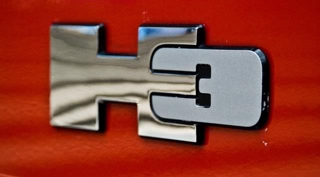
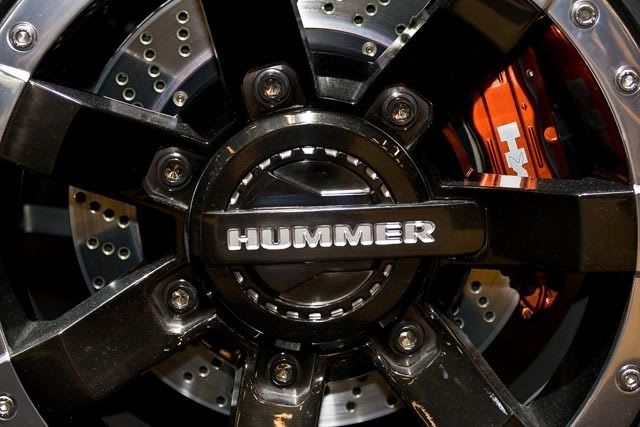
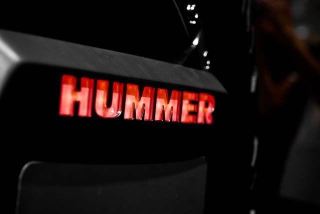

Best H logo. Hummer dealerships are built around a giant “H” that functions as both entrance and supergraphic visible from highways. But the best H logo was that of Horch, the prewar German company that enjoyed a status not unlike Buick in the U.S. Its H was formed to suggest the gateway of a city or castle-an image of sturdy tradition.
JEEP:

Jeep, originated from General Purpose, rolled out what the company called its first logo ever: “A graphic representation of the front grille and windshield of the Wrangler, the icon of the Jeep brand depicts the strong styling cues of the Wrangler, the seven-slot grille, round headlights and rectangular windshield.” Jeep is one of the best known brands in the world, that it should not have a logo or emblem is surprising. The image elicited by the word “Jeep” is clear as a logo that represent a vehicle, boxy and basic and outstanding .
MERCEDES


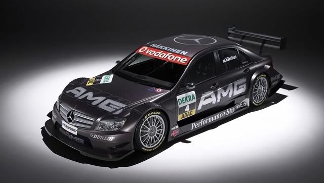

Mercedes tri star, the story goes, was inspired by a star Gottlieb Daimler penned on a post card of Cologne, marking where he was living and sent to his children. Today, a rotating tri star is visible on the skyline of almost every German city. Benz brought the wreath when Mercedes and Benz merged in the 1920s. The ring around the tristar was patented in 1923.
MAYBACH
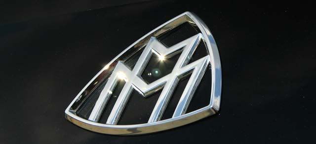
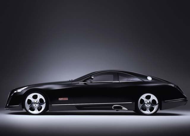
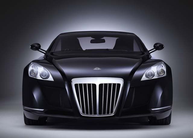
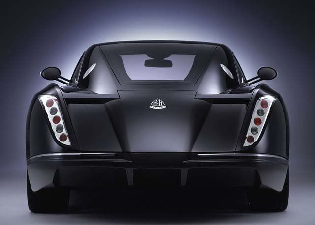
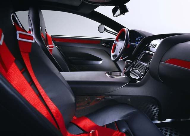
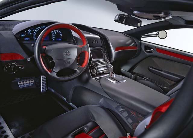
In reviving the super luxury Maybach brand of the 1920s, when it was favored by maharjas and marquis, Mercedes updated an almost Wiener Secession looking “M.”
OLDSMOBILE
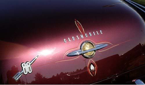
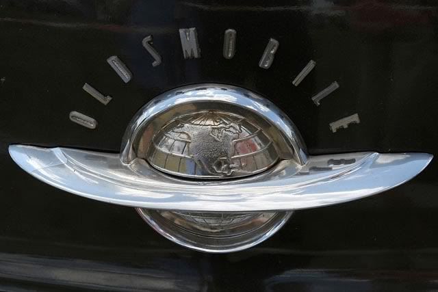
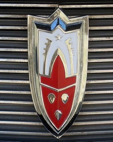
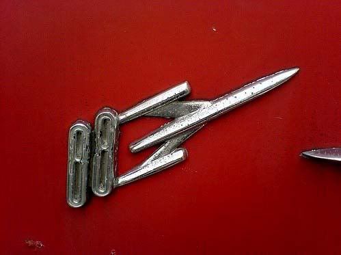
The 1950s and 1960s were great years of exuberant auto graphics-as they were for auto bodies. I recall from childhood the Oldsmobile globe-in-a-ring and rocket emblems, and the Rocket 88 symbol-part Werner Von Braun, part Chesley Bonestell-images that made the unabashed conation between motoring and space flight.
PORSCHE
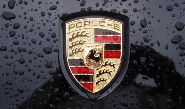


Porsche borrowed arms from the city of Stuttgart, where it located its headquarters.
VOLKSWAGEN


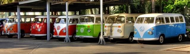
Volkswagen’s iconic buttressing of V and W was the creation of an engineer named Franz Reimspiess, the same man who perfected the engine for the Beetle in the 1930s. He won fifty marks in an office competition to do the job. Before WW II, when the car was still Hitler’s “Strength through Joy” car the logo was surrounded by the gear shaped emblem of the German Labor Front that built it.
SUBARU


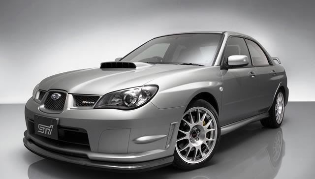

Coolest recent logo: Subaru’s five star logo refers obscurely to the keiretsu joined together in the parent company Fuji Heavy Industry. But this the new high performance road rally inspired Sti model (for Subaru Technology) arrived with a hot pink and high (graphic) fashion logo on its horn button, side panels, radiator and two or three more places. The parallel looping lines of the Sti logo suggest hip retro graphics such as old American basketball association expansion team emblems or the recent logo for the band OK Go by Stefan Sagmeister.
Adapted from The Language of Auto Emblems, pictures are courtesy of Flickr and Fastwallpapers.com


0 nhận xét:
Post a Comment